MacBook Pro Review
I received my base-level 14-inch MacBook Pro on launch day last week, and so far, I’m very happy with it. In short, this is the MacBook Pro that serious professional users have been waiting for.
Design
The most obvious change is the new case design. These new Macs have more in common with their much older siblings than anything in recent memory. In fact, I’m happy to say that the closest comparison I could find is my favorite Mac of all time: the first generation MacBook (mine, of course, was black). This new Pro looks like a squished version of that, and I love it. Other (older) folks are saying that it reminds them of the titanium PowerBook G4, which makes sense as well. Apple seems to be going through a nostalgia phase in their designs, and I’m all about it.
The display is completely flat rather than tapering off slightly near the edges, and the rounded bottom case gives it a substantial heft. Apple is no longer prioritizing form over function, and the bulkiness of these laptops compared to the previous generation proves it. That’s not to say this 14-inch MacBook Pro is too heavy or too thick, but if you’re looking for a purely travel-focused laptop, you’ll probably want the M1 MacBook Air.
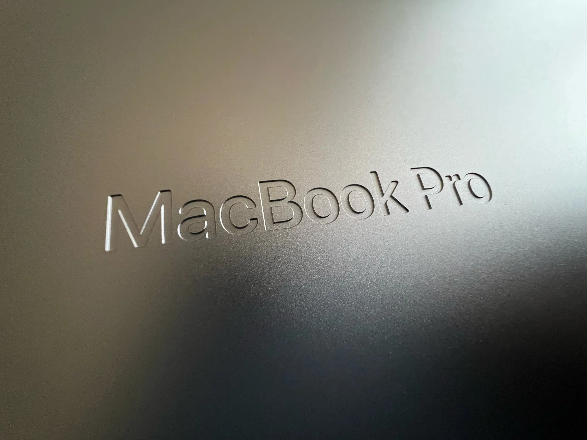
The display bezels are much thinner, and there’s no longer a MacBook Pro logo under the display. I never minded having a logo there before, but now that it’s gone, it does seem distracting on my MacBook Air. In case you forget which Mac you’re using, the words MacBook Pro are now debossed on the bottom of the device (as pictured at the top of this post), and it looks awesome.
Display
The display looks very, very nice. I want to make sure I say that up front, because the rest of what I have to say might sound like I don’t like it.
The two things I was most excited to see have thus far not impressed me like I had anticipated: ProMotion and HDR.
When I first saw ProMotion on the iPad Pro, my brain exploded. When I first saw ProMotion on my new iPhone 13 Pro Max, my brain exploded again. The experience was so much better on both of those devices that it has made going back to non-ProMotion devices difficult.
So far, I haven’t really noticed ProMotion on the MacBook Pro, and I’m so sad.
To my eye, there’s little difference between ProMotion and plain 60Hz. My main criteria for a high refresh screen is how easy it is to read text as you scroll. With the iPhone and iPad Pro, I can tell how much easier it is to continue skimming text as I scroll quickly through it, especially when I go back to my new iPad mini and its 60Hz screen. On the MacBook Pro, it doesn’t look much clearer as I scroll through Safari than it did on my MacBook Air. I saw some early reports of people saying the same thing, and I held out hope that they were just dummies…but sadly, I agree.
Even Nilay Patel from the Verge agrees:
But I could only just barely see the improvement that 120Hz offers in normal, non-gaming use, and only when really looking. It’s just less obvious when it’s not a touchscreen.
My most successful test of ProMotion was when I opened Ulysses (my writing app of choice) in full-screen mode on both my MacBook Pro and MacBook Air. With nothing but black text on a stark white background, scrolling does look pretty blurry on the Air while the Pro looks much smoother. I think some other apps need to be updated to take advantage of the variable refresh rate, so we’ll have to see how it evolves.
UPDATE: So I wrote all that stuff about ProMotion, and then an article was published on 9to5Mac about Mac app compatibility. Apparently, as of this writing, most Mac apps don’t support 120Hz, including Apple’s own Safari browser. From what I read, Catalyst apps (apps that are written for the iPad and ported over to the Mac) do support it. One of the best Catalyst apps available is Messages, and sure enough, scrolling through an iMessage conversation looks really great. So ProMotion will be great at some point once Apple decides to let developers know how to take advantage of it.
As for HDR, I haven’t really been able to test it. I was excited to try a 4K HDR movie in the Apple TV app, but that app has a bug that makes it absolutely unusable. If I try to open a movie, it briefly shows a black window and then it closes. According to a forum post I found, this has been an issue since at least April, and apparently macOS Monterey did nothing to correct it. Unfortunately, it will only let me download a 1080p version of the movie, which wouldn’t include HDR. I was able to AirPlay Avengers Infinity War from my iPhone to the Mac (yes, you can use a Mac as an AirPlay receiver now), but I’m not sure if that was actually HDR since it was a stream of a stream. I still need to find some good HDR content to test this out.
So yeah, ProMotion and HDR are downers for me right now.
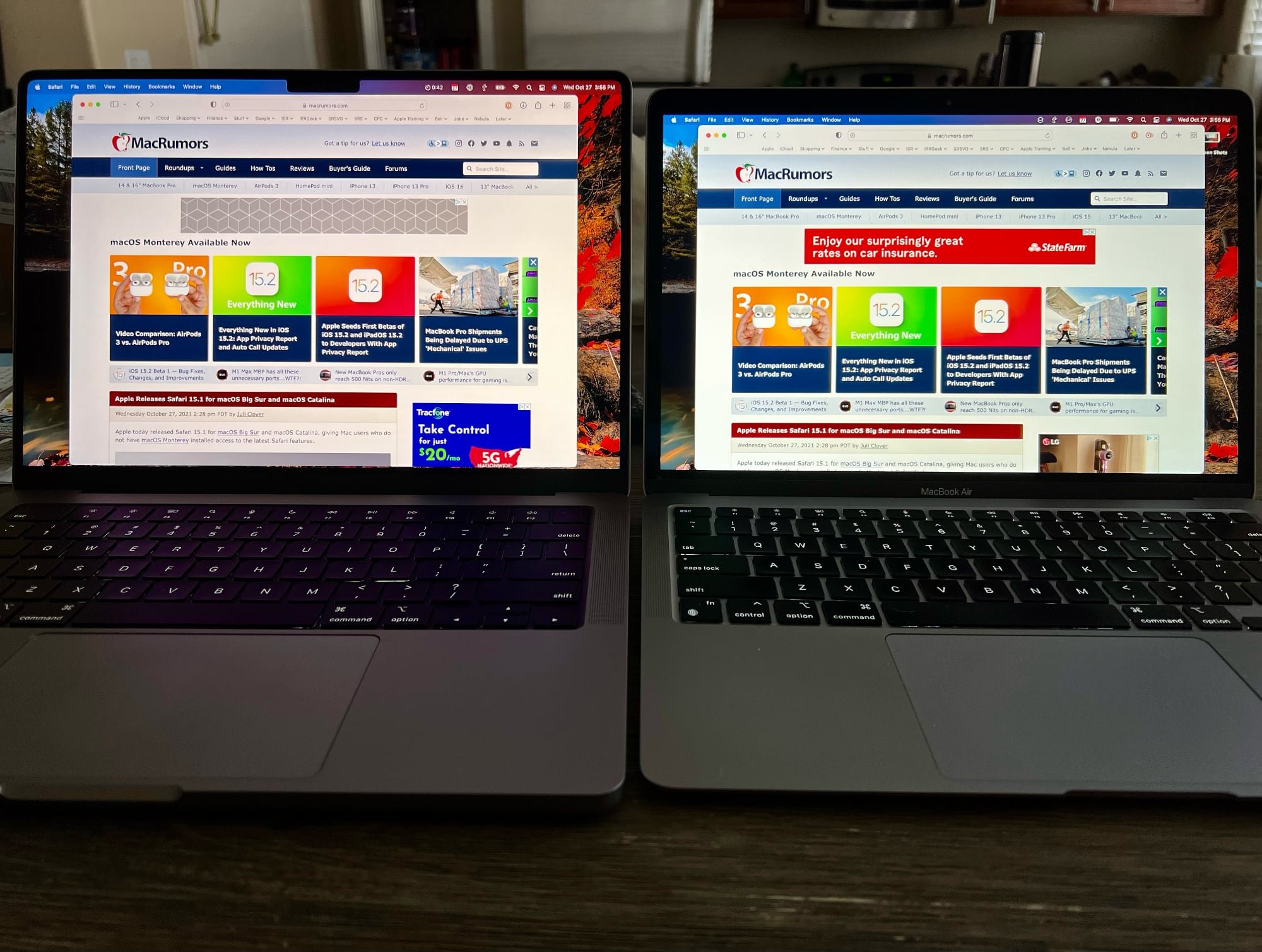
The screen reaches a max SDR brightness of 500 nits, which I hoped would be a noticeable improvement over my MacBook Air’s 400 nits, but it’s really not. Side-by-side, they look just about the same. The contrast should be much better because of the MacBook Pro’s mini-LED screen, but that’s not something you’ll notice in day-to-day use. This Twitter post shows the difference in contrast with an M1 MacBook Pro, and it’s pretty impressive.
The brightness factor is actually a huge letdown for me, and it’s a direct result of the way Apple has marketed these machines. If you look at the MacBook Pro webpage, the only specs you’ll see about the display are “1,000 nits sustained brightness, 1,600 nits peak brightness.” I assumed that meant that tapping the brightness-up button would take me up to 1,000 nits. Unfortunately, those specs are only for HDR content. SDR content (so, almost everything you’ll see on this screen) only reaches 500 nits.
Pro (left) vs. Air (right)
What I do love is the extra screen space. It doesn’t feel that much bigger than the Air, but when I put them next to each other with the same webpage open in Safari, I could read at least a few more lines on the 14-inch screen. It’s not much, but one of my jobs involves lots of scrolling through databases and Salesforce records, and it definitely feels roomier. I also really like how the menu bar is nestled around the camera notch, and the fact that it’s a bit taller as a result. It makes the whole UI feel fresh.
I don’t even notice the notch in regular use. In full screen mode, the notch is hidden by a black bar across the top of the screen. You’re left with the same 16:10 area of usable space beneath it, and moving your cursor up to the menu bar causes it to appear within that black area. On other Macs, the menu bar pushes down on top of your content, which isn’t ideal. You can also choose to permanently show the menu bar in full screen mode, but I prefer to keep it off because it can be distracting.
I downloaded a free app called TopNotch that turns the menu bar black even in non-full screen mode, but I’m not sure I like it. The notch doesn’t bother me and I like having a bit of color in the menu bar, so I think I’ll leave it alone.
Also (I promise this is it for the display), I forgot that Mac laptops since 2016 haven’t used a full “retina” resolution by default. They technically shipped with a scaled resolution that gives a bit of extra screen space at the expense of some crispness. You could adjust it in settings, but you’d end up with a lot less usable space. These new MacBook Pro displays have enough pixels that the default resolution is full retina while still offering a ton of usable space. Looking at this next to my Air, the difference in sharpness is noticeable. Text just looks cleaner on this screen. I wouldn’t say it ruins me for the Air’s default resolution, but it’s nice all the same.
Keyboard and Trackpad
The keyboard feels a bit different from the one on the M1 MacBook Air. Apple says the keys have “the tactile feel of mechanical keys that pros love,” and while that might be a stretch, they do feel more substantial and give a deeper, more satisfying “thud” sound. I like this keyboard a lot.
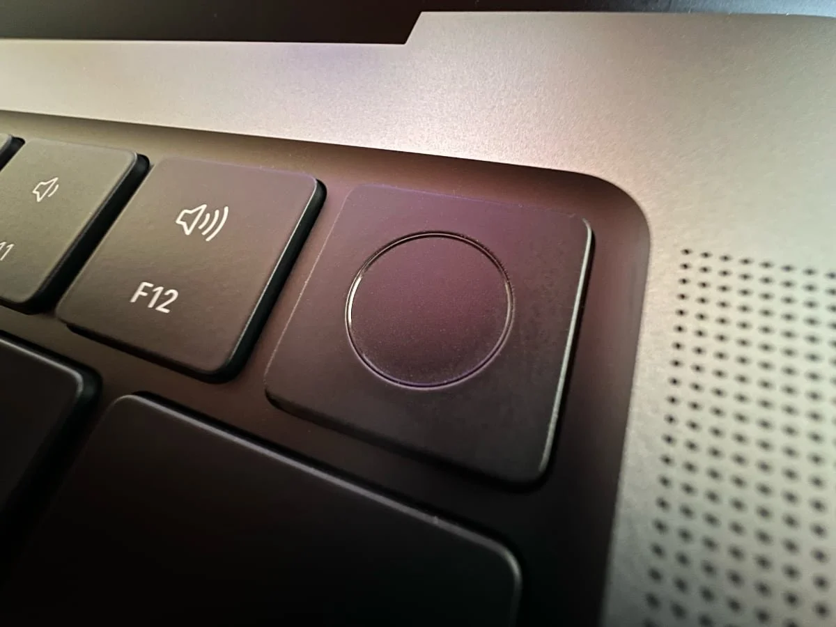
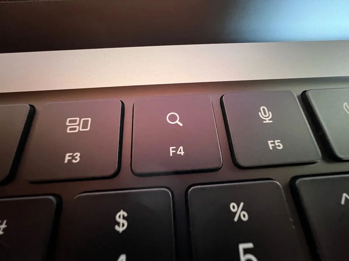
The full-height function keys are nice. I never disliked the narrow function keys on the Air, but if I can have large keys, I’m all for it. It also allows for a nice big Touch ID sensor, which is concave so it’s easier to find it in the dark.
I also love love love the black anodized aluminum behind the keyboard. It may sound silly, but it adds to the “pro” feel of this laptop and it’s also one of the biggest factors contributing to the titanium PowerBook comparisons.
And of course, the trackpad is still the best in the business. The click sounds and feels a little different than the MacBook Air…it’s deeper and it almost echoes like there’s more air under it. Not a good or bad thing, just an observation. Of course, the trackpad is still a solid piece with no moving parts. The haptic feedback that makes your brain think you’re clicking is still as magical as ever.
Now, my gripes. While I appreciate the shortcuts on the function keys, I wish they had kept keyboard brightness as an option there (though, admittedly, that’s been gone for a while now and isn’t unique to this Mac). The brightness toggle for the backlit keys is now hidden in Control Center, and I don’t like it as much as being able to tap a key on the keyboard. I’ll probably never use the dictation, exposé, or spotlight keys as much as I’d use keyboard brightness, but maybe that’s just me.
I also wish that the Touch ID sensor had some sort of backlight. If you’re in a dark room, that corner of the keyboard is just a black void. It’d be nice to have a backlit ring to see where you should set your finger. Maybe it could pulse when it’s waiting for input or something. I don’t know, I’m not a designer.
Ports
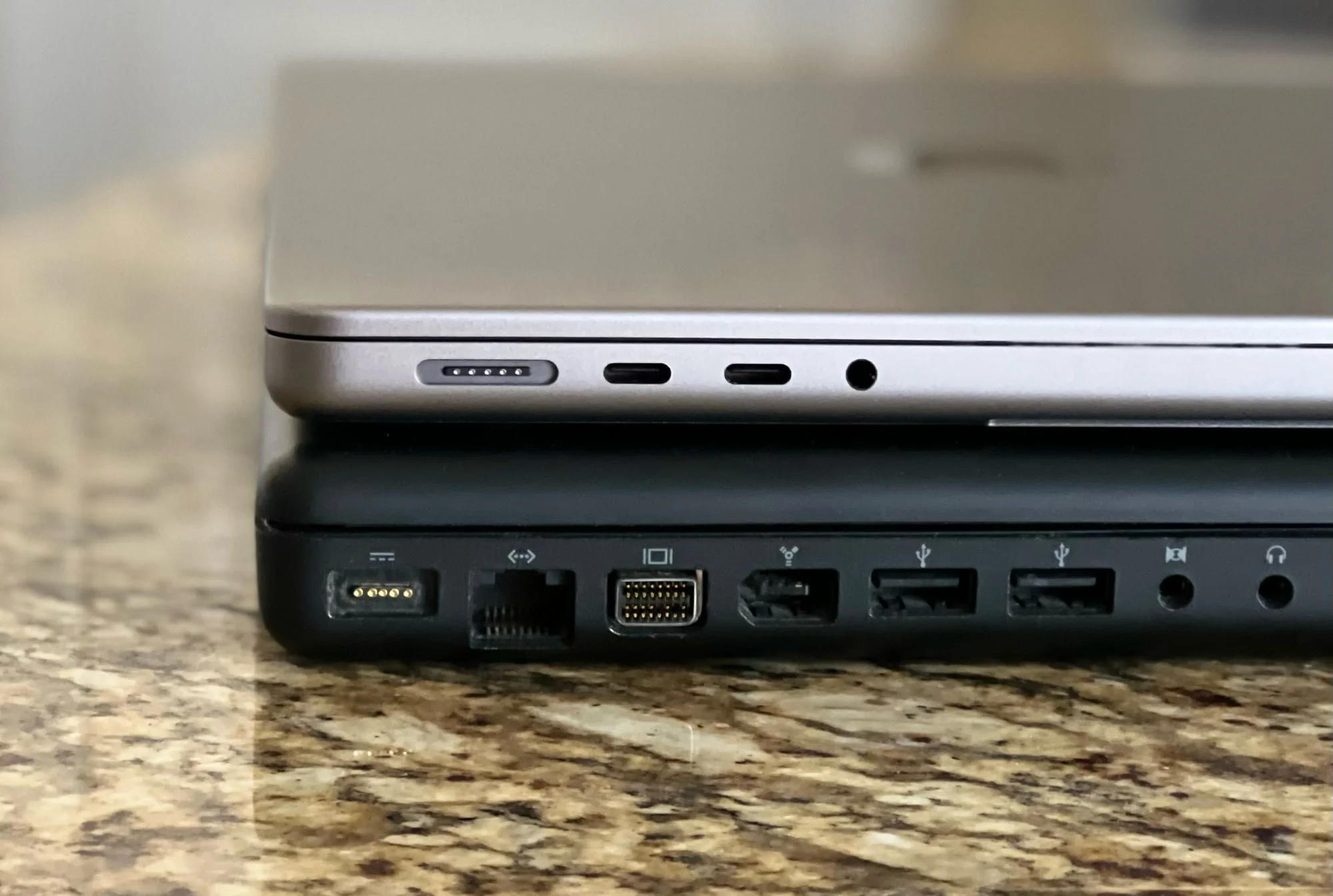
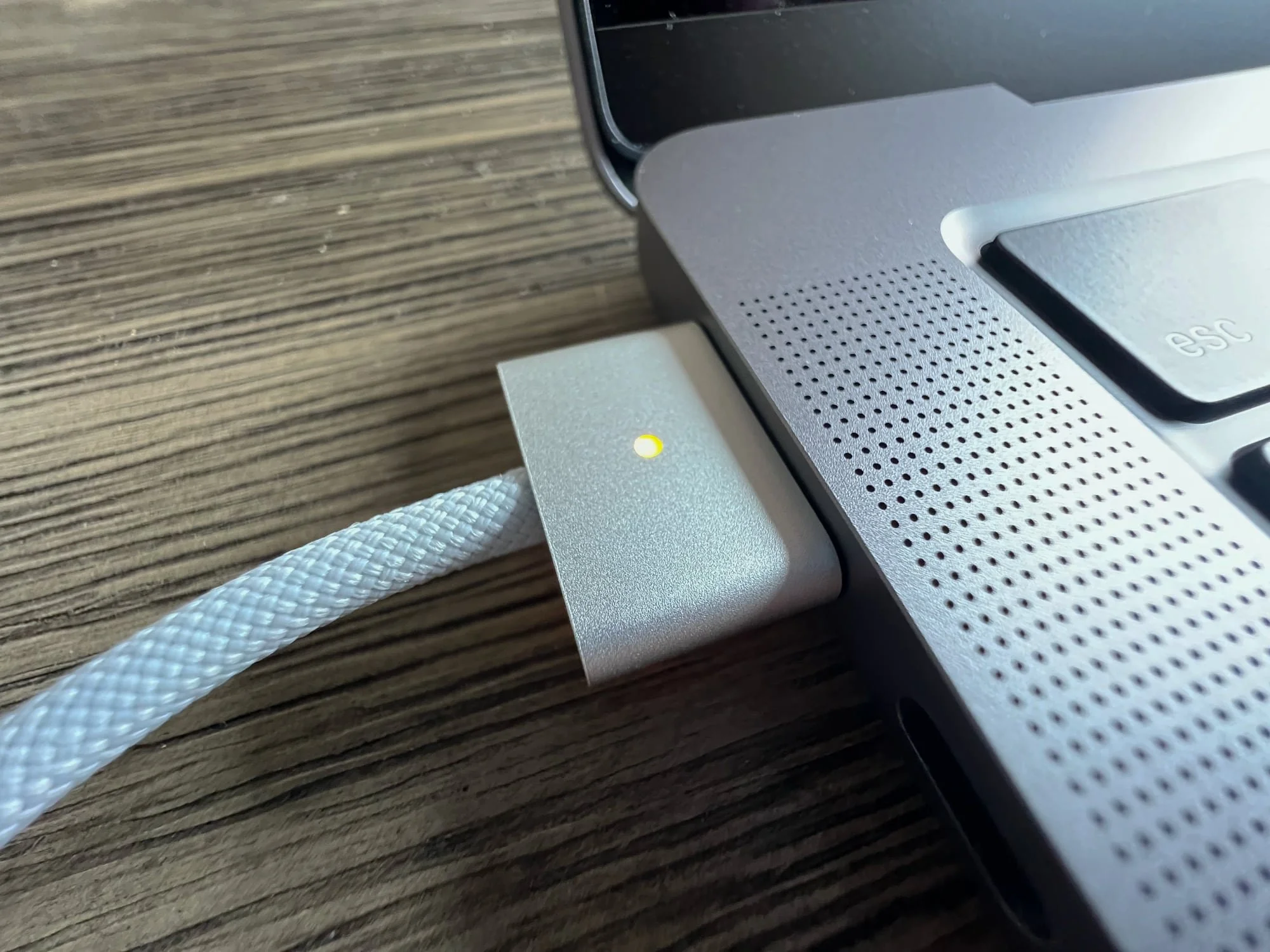
I was very excited to have MagSafe back on a laptop, and the excitement was warranted. The click is so familiar, it tickles the same nostalgia bone as the laptop’s design. I also forgot how nice it was to have an LED indicator to show whether or not the battery is full.
One thing to note is that the magnet feels much stronger now than it ever did before. It’s actually pretty difficult to disconnect it, though I’m still confident that it’ll easily pop off if some dummy (myself included) trips over the cable.
Speaking of the cable, the new MagSafe cable is braided now, and it’s very nice. And I really appreciate that it connects to the power brick via USB-C. That means you can swap cables to use the same brick to charge any other USB-C device, which really helps to keep clutter to a minimum for travel.
I grabbed an SD card out of my Nikon to test the SD slot and…it works. There isn’t much else to say. If you use SD cards, you’ll absolutely love having this. I’ve read that this slot is relatively shallow, which I can’t confirm because I don’t know what the old ones were like. In the past, companies have made adapters that hold micro SD cards and that sit flush within the SD slot. You could essentially have a full Time Machine backup on a micro SD card that lives inside your computer, which I want. The concern is that this slot might not be deep enough to accommodate it, but we’ll have to wait and see.
I don’t use HDMI often, and I’ll probably still carry my USB-C to HDMI dongle to use with my iPads, but it’s still nice to have a port built into my laptop.
Audio
The speakers really do sound incredible. There’s just enough bass that you wouldn’t mind listening to music with this thing, but what really got me was the spatial audio. When I used AirPlay to play Avengers Infinity War, it truly sounded like it was all around me. I don’t know how this witchcraft works, but I love it.
I haven’t really tested the microphones, but I can say that my old 16-inch Intel MacBook Pro had a similar “studio quality” three-mic array, and it was very good. I had a Zoom call and the other participant could hear me, so they definitely work. I probably wouldn’t record an album with these mics, but for video calls and (in a pinch) podcasting, they’re good.
Camera
I only have two things to say about the camera: I’m so glad it’s 1080p, and I kinda wish it had Center Stage (Apple’s tech that uses a wide-angle camera and automatically zooms and pans to keep faces in the center of the frame).
My best guess as to why Apple omitted Center Stage here is that this is considered a professional laptop. If you’re conducting a presentation or interfacing with work colleagues on a video call, you’re probably not wandering around or pulling in your housemates to say hi. You sit in front of your computer, get your business done, and go about your day. If the camera were constantly zooming and panning to focus on other faces in the frame, you may end up with some awkward work-from-home situations.
Center Stage makes sense on an iPad because an iPad, even a Pro one, is considered more of a leisure device. I’m much more likely to use an iPad for a FaceTime call with my family than my MacBook Pro. That said, they could have included Center Stage with an easy on/off toggle. Maybe some day.
I did use it for one Zoom call and as far as I could tell, the quality was excellent. It’s not even just the fact that the camera is now 1080p, it’s also using the built-in image signal processor to tune the image and make sure that my face is well lit and in focus. If you’re on a lot of video calls, you’ll appreciate the improved quality here.
Performance
M1 Pro
Maybe this should have been first, but as you may or may not know, I’m not necessarily a power user. Other reviewers have put these laptops through every benchmark imaginable, and they’ve blown everyone away. My favorite reaction was when Justine Ezarik sat down with a videographer friend who does a lot of super intense video work, and he was shocked. Of course, she had a top-spec 16-inch MacBook Pro that did things no laptop should be able to do, but they also tested an entry-level 14-inch MacBook Pro (the same one I have) and were still floored by its performance.
That particular reaction was helpful for me, because I’ve been wondering if I made the right decision by sticking with the lowest tier model. My M1 MacBook Air has handled everything I’ve ever thrown at it, and this MacBook Pro is more capable in every way, but just knowing that I have a binned version of the M1 Pro makes me think that it’s hamstrung in some way…like it might choke if I ask too much of it.
In case you’re not familiar, chip binning is basically when a manufacturer ends up with a lot of chips where some of the cores don’t function properly. Rather than scrap them, they sell them as-is, usually in lower-cost machines. In this case, the M1 Pro is marketed as having “up to” a 10-core CPU, and “up to” a 16-core GPU. My particular model has an 8-core CPU and a 14-core GPU. The M1 Max is similarly binned, offering either a 24-core or 32-core GPU.
Max Tech has a great video comparing the base model 8-core 14-inch with the un-binned 10-core model, and based on their results, the base model is powerful enough that the extra $300 for the un-binned M1 Pro may not be worth it. It’s especially capable with image and video editing and exporting, which is the most intense work I would be doing on this thing.
If you work with 8K footage, or you do intense color-grading or 3D modeling, you may want to opt for the M1 Max with 64GB of RAM. The cool thing is, that crazy powerful chip can be had in the smaller 14-inch MacBook Pro and it’ll be just as effective as its larger sibling. No longer do you have to choose the largest laptop to get the most powerful laptop. The only tradeoffs are the size of the screen and battery life.
Battery Life and Charging
Like the M1, the M1 Pro sips battery power. I’ve been using this thing on the charger for the most part, but I have a trip coming up, so that’ll be the best test of the battery. I can say that I unplugged it Friday morning, used it to write this review and complete other work tasks for most of the day, used it a little on Saturday, left it alone Sunday, and by Monday morning, it was only down around 29%.
If you want the absolute best battery life, the sweet spot seems to be the 16-inch MacBook Pro with the M1 Pro chip. The combination of the massive battery with the lower-power M1 Pro gave testers at The Verge around 16 hours of continuous use, which made it the longest-lasting laptop they’ve ever tested. That’s just insane.
The charging situation is a bit complicated with these new MacBook Pros. Of course they all support MagSafe, but they also support charging over USB-C. Both the 14 and 16-inch laptops also support fast charging, getting you from 0 to 50% in just 30 minutes.
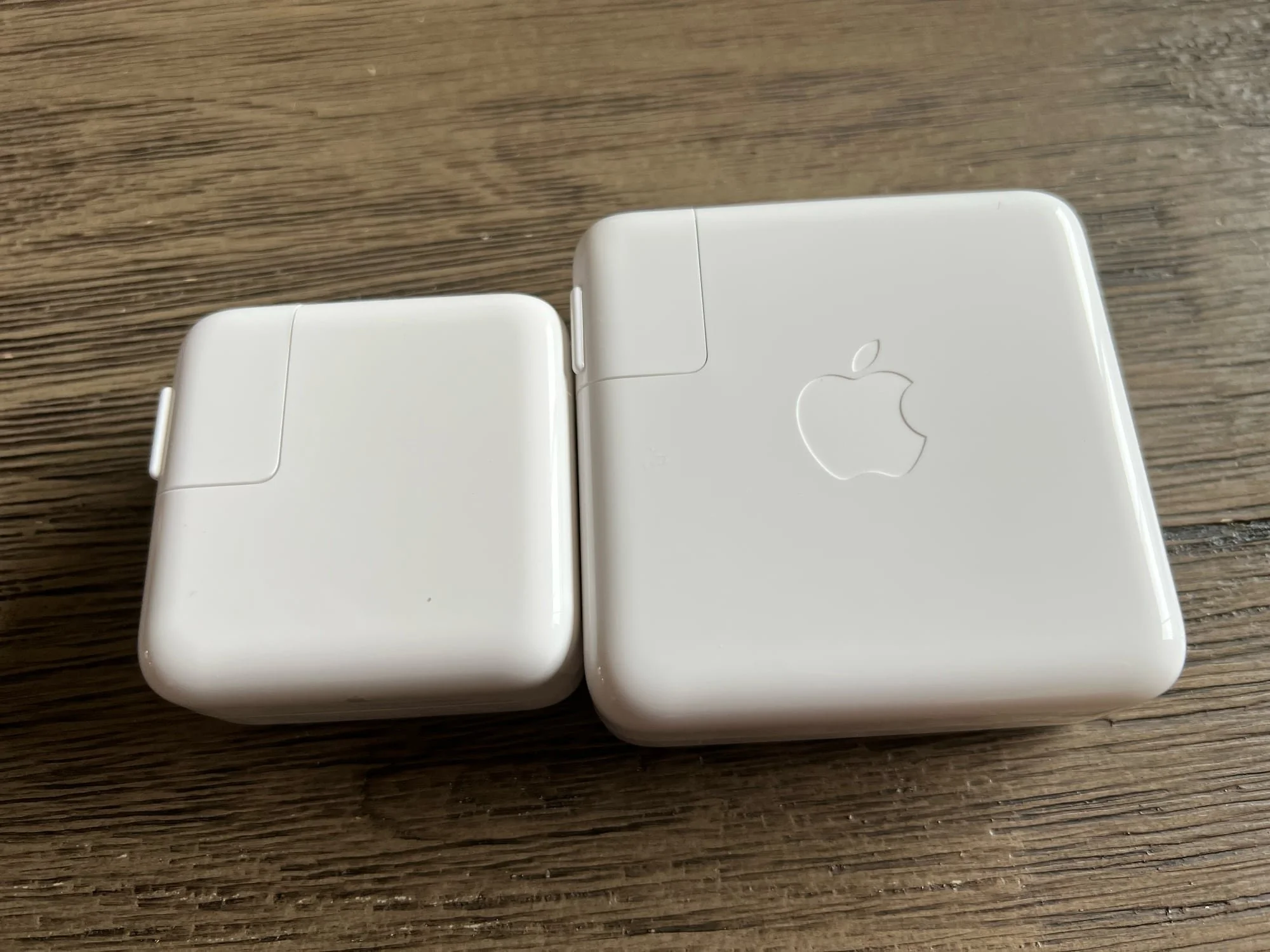
The complicated part is how to take advantage of fast charging. There are three new charging bricks available: a 67W, 96W, and a whopping 140W brick that looks like the old AirPort Express WiFi router.
By default, the base model 14-inch ships with the 67W brick, which does not support fast charging at all. Only the 96W brick will provide fast charging on the 14-inch MacBook Pro, and it’s only a $20 up-charge to get that brick with the base model. I really wish I had spent that extra $20 because buying the brick separately costs $79.
30W MacBook Air charger (no Apple logo) vs. the 67W MacBook Pro charger
If you opt for the higher tier 14-inch model, you get the 96W brick by default. That will fast-charge your laptop over MagSafe or USB-C.
All 16-inch MacBook Pros ship with the 140W brick, but that only supports fast charging over MagSafe. The USB-C spec that allows for such crazy power delivery is still so new, Apple couldn’t put those ports in these machines.
Even with the 67W charger, my MacBook Pro seemed to charge quicker than my MacBook Air does, which makes sense since that charger is only 30W.
In short, the whole situation here is very nice. The battery lasts a long time, even the lowest wattage charger is pretty fast, and MagSafe is a joy to use.
Other Tidbits
The Apple logo on the lid of the new MacBook Pro is quite a bit larger than the old machines, and I love it. It adds to the nostalgia factor since the logo had gotten smaller in recent years, but I wish that Apple had gone all-in and made it glow again. That was one of the most distinctive and iconic features of older Mac laptops. I assume it’s just not possible to build that tech into such a thin display.
The feet, which look massive in Apple’s marketing photos, are not near as pronounced as I expected. One result of this new design is that the laptop no longer appears to float above the table quite like it did when the case was more tapered. Certainly not a knock on the design, just an observation.
Also, the Apple stickers included with the new MacBook Pro are black! Black stickers have only been included with Apple’s top-tier pro devices like the Mac Pro and iMac Pro, so it’s awesome that they now include them with the MacBook Pro as well.
Wrap Up
I love this laptop. I’m hesitant to say it’s the best laptop I’ve ever used, but it’s definitely close. I was confident saying that about last year’s M1 MacBook Air because that thing is so close to perfect. It’s a performance beast in a thin, light, fan-less case and its starting price is hard to beat at $999. I would still recommend the Air to almost anyone in the market for a new laptop.
The MacBook Pro is a slightly harder sell. It’s more capable than the Air in every way, but it’s also a decidedly professional laptop (with a price to match). Apple stopped sacrificing performance for the sake of design, so these Macs are really best suited for intense pro workflows. If you’re not sure whether or not you need a MacBook Pro, you probably don’t need a MacBook Pro.
Of course, if you have the money to burn and you don’t need the thinnest, lightest laptop around, go for it. You’ll love this Mac. The design is lovely, the screen is beautiful and will get better as apps are updated to take advantage of it, the keyboard feels great, the camera, speakers, and microphones are excellent, MagSafe is a delight, the ports are useful, battery life is phenomenal…there’s a lot to love.
If you just need a laptop for web and email use, the M1 MacBook Air is still the gold standard. But if you’re a serious photographer, graphic designer, or a video or music professional, you’ll be hard-pressed to find a more capable overall machine than the new MacBook Pro.
